The Millipedic Limbs of Military Spending

On nights you’re up late in bed, sleepless with incurable headache, just beat down and wondering where the hell exactly all your hard earned income tax dollars have gone, interminably curious and confused about how they’re actually being spent; and, perhaps, more importantly, how they will go on being spent this next year, and the years to follow – well, you might be able to rest a little easier, now, I don’t know.
Probably not, actually.
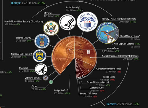
In any case, you might at least get a more clear picture of the spending skeleton that supports the body of the American federal budget by looking at this incredible interactive visualization project put together by Wallstats -- it's a totally fascinating and simplistic representation, easy to navigate, and you won't be able to help yourself from getting lost in it – your untangled tax trails as they’ve been allocated by the U.S. government made bare, for you to sniff and follow.
"Death and Taxes:2009" is a representational poster of the federal discretionary budget; the amount of money that is spent at the discretion of your elected representatives in Congress. Basically, your federal income taxes. The data is from the President's budget request for 2009. It will be debated, amended, and approved by Congress by October 1st to begin the fiscal year.

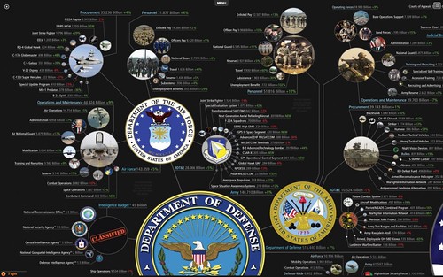
The sheer complexity of this thing is maddening alone, not to mention the fine print realities of it all, particularly the micro-parcels of sums that are feeding the war machine. This is when I wish I had a 30” widescreen monitor so I could blow this up and see it sprawling in all its graphical entirety. Time to forward to my friend who does.
I may just have to buy the poster since I find it is so damned cool. You should, too.


Just look at the millipedic appendages of separate spending categories that spoke of the 515 billion dollar Department of Defense Budget. Astounding.
Pretty incredible map, I must say. I love these visualizations, total referential mania! So there it is kids, the financial architecture of the military industrial-complex and its dollared footprint mapped there for your awesome gander. Have fun -- hours of looking fun!
And, for a nice read along: It's Time for a Trillion-Dollar Tag Sale at the Pentagon, "When we want to get serious about a long-term bailout strategy, we'll start dismantling the American empire and Pentagon programs." - Nick Turse.


2 Comments:
Thanks a lot for the link. It's an incredible, wonderful and scary visualization.
To embed, just copy and paste the code. You can find it in the Menu, at the top of the poster ;-)
Great blog! (a follower from Spain)
algarabia
thanks so much!
Post a Comment
<< Home